 By
By 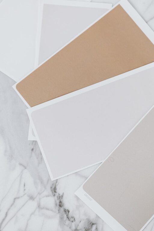
Creating a peaceful and relaxing atmosphere in your home starts with the colors you choose for your walls and décor. Calm colors have the power to soothe your mind, reduce stress, and make your space feel inviting. Whether you are repainting a room or redecorating, selecting the right calm colors can transform your home into a sanctuary.
In this post, we’ll explore how to choose calm colors for your home and offer practical tips to guide you through the process.
Why Choose Calm Colors?
Calm colors are typically soft, muted shades that create a sense of balance and tranquility. These colors can help:
– Promote relaxation and reduce anxiety
– Enhance concentration and creativity
– Make a room feel more spacious and comfortable
– Complement natural light and other design elements
Understanding the benefits of calm colors can help you make better choices for your home environment.
Popular Calm Color Palettes
Before diving into tips, it’s useful to know which shades are commonly considered calm:
– Soft Blues: Often associated with the sky and water, they bring a fresh, peaceful vibe.
– Gentle Greens: Reminiscent of nature and foliage, these colors evoke harmony.
– Muted Grays: Neutral and balanced, perfect for a subtle background.
– Warm Beiges and Taupes: Earthy and cozy, they offer warmth without overwhelming.
– Pastel Lavenders and Pinks: Soft and inviting with a touch of elegance.
Tips for Choosing the Right Calm Colors
1. Consider the Room’s Purpose
Think about how you use the room. For example:
– In bedrooms, choose colors that promote sleep and relaxation, like soft blues or muted greens.
– In a home office, consider calm but focused colors such as light greens or warm grays.
– In living rooms, you might want a balance between calm and welcoming; warm beiges and gentle pastels work well.
2. Test Colors in Different Lighting
Lighting can dramatically change how a color looks:
– Check your chosen paint colors in natural light and artificial light during different times of day.
– Use small samples on your wall instead of relying only on paint swatches.
– Remember that north-facing rooms often receive cooler light, which can influence how warm or cool a color appears.
3. Use Color Samples and Swatches
– Paint small patches on the wall or use large paper samples taped to different walls.
– Live with them for a few days to see how the calm colors affect your mood and blend with your furnishings.
4. Balance Calm Colors with Neutrals
Pair calm colors with neutral shades like white, cream, or soft gray to maintain harmony:
– Use neutrals for larger areas like ceilings, trim, or flooring.
– Incorporate your calm colors on accent walls, furniture, or décor to add depth without overwhelming the space.
5. Consider Undertones
Every color has an undertone, which can influence whether it feels warm or cool:
– Blue can have green or purple undertones.
– Beige may lean towards yellow or gray.
– Be sure to choose calm colors whose undertones complement your existing home elements.
6. Create a Cohesive Color Scheme
To maintain tranquility throughout your home:
– Choose two or three calm colors that work well together.
– Use one dominant color and accent with the others to create visual interest.
– Apply these colors consistently in different rooms to establish flow and unity.
7. Don’t Forget Texture and Finish
Color is important, but so is the surface finish:
– Matte or eggshell finishes absorb light and enhance calmness.
– Glossy finishes may reflect too much light and feel less soothing.
– Soft textures in fabrics and décor will complement your calm color choices.
8. Use Color Psychology to Your Advantage
Certain colors naturally evoke calmness:
– Blue is known for its calming and cooling effect.
– Green symbolizes renewal and tranquility.
– Soft neutrals create a stable and grounding environment.
While personal preference matters most, understanding basic color psychology can help reinforce the calming effect.
Additional Ideas for Enhancing Calmness with Color
– Add plants: Greenery adds life and complements calm color palettes naturally.
– Incorporate natural materials: Wood, stone, and natural fibers enhance calmness.
– Limit bright, bold accents: Too many bright colors can disrupt the tranquility.
Final Thoughts
Choosing calm colors for your home is a thoughtful process that pays off with a more restful and welcoming space. By considering the purpose of each room, testing colors under various lighting, understanding undertones, and balancing calm hues with neutrals, you can create a beautiful and serene environment.
Remember, your home should reflect your personal comfort and style. Take your time exploring color options, and enjoy the journey of making your space a peaceful retreat.